

As promised, I post an overview of our weekly class so that students can have a list of links and information about topics covered. Last night, we discussed the role of human-centered research as it relates to social impact projects. I think that all the students will confess that the hardest part of this process is finding out what are the right questions to ask in order to map out your research plan.
Because of this, I invited a graduate of Emily Carr to present her research as a case study of how the process can unfold in order to develop a deliverable. It is one example of how a designer can approach the research process. There are obviously many more!
We also touched (very briefly) on the importance of ethics in the process of research. This is a large topic but we discussed how we can ensure that our participants are made aware of what their involvement entails.
Three groups have formed and are focusing their projects on a topic of their choosing. They have opted for Living/Dwelling, Education and Aging. Each group has been working to refine the problem they want to tackle in each given area so as to develop a research plan. These are some links we looked at in order to frame the next phase of their projects:
Human-Centered Design Toolkit
Ethnography Primer
Raneen Nosh, Designer
IDEO Method Cards
Design Council RED
Participle
Sam & Dave Save The World
Sample of Informed Consent Document
And this is a great link that considers the brainstorming process (in business or social change projects!): Better Ideas Faster
If other educators or designers have links to share, I'm sure the students would be grateful.
30 June 2010


22 June 2010


Design For Social Change started tonight and I'm delighted to report that I get to work with a great crop of students! We agreed that I could post outcomes and links that resulted during each week so as to chronicle this inaugural course.
The images above represent the start of their "actionable problem statements" that were developed after everyone expressed areas they would like to see design contribute to when approached as a conduit for "social change." Main objective? Focus on change as opposed to awareness. Here are some of the links/case studies we explored or discussed during this class:
Tim Brown's TED Talk
Curitiba's Transportation System
Target ClearRx
Zipcar
Deep Dive
Kiva
Index: Award
Design Revolution
Do Good Design
Designer's Atlas of Sustainability
A highlight for me? Many see this as a portfolio building opportunity because of the type of approach and research it requires. Yay!
15 June 2010
Can a logo change the world?
Well, this one certainly has, hasn't it?
As I prepare to head to Seattle to participate in this event, I continue to reflect on the role of design in a place like Rwanda. Designing a logo with the women of the weaving cooperative is a reminder that sometimes the little things become the conduit for potential bigger things. When I visited the women last month, they were preparing products for a trade fair in Kigali. To see that they could now have their own brand identity to represent the work among many others gave me hope that design will continue to play a role in their community and future. How that happens is yet to be fully realized but as a consumer of their products, this identity mark does offer additional value to the product as it sits on a shelf.
We know that logos are a language that have the power to help or hinder in our world. While the logo is seemingly a reflection of the company or organization's actions, it is also the visual mark that everyone will remember (or easily forget). To me, it's like naming one's child - with this act, you project or claim a hopeful future. Following that logic, I wouldn't suggest that naming and identity alone can ensure anything. It's how and what you deliver in the end that ensures this identity continues to hold value. For these women, I hope they can increase their product offerings in the future to ensure a distinct market, which the logo has only begun to establish. And in their case, this distinction could change their world by moving them from a wage of $1-2/day to $15-20/day.
These images reflect the co-design process - from concept drawings to a final stamp.


05 June 2010
A Recap of Rwanda
I had anticipated having more time to write about my design work while in Rwanda. Since the fiber optics continue to be placed in the ground, the bandwidth is not yet at the capacity required for effective photo and video uploading. So here's a few tidbits that I wanted to share now that I'm home. These vignettes capture some of my design encounters as I spent time in various parts of the country over the past month.
1. Coffee Processing Tour

During my visit to this plant, I learned about the life cycle of the coffee bean. Notably, beans that are not usable for the highest quality roasting are not discarded. Instead, companies like Nescafé take them on for their coffee purposes.
2. Spaces for Ideas Book

I came across Brian Ling's books before I left and wanted to take some along with me. They arrived in time and I used them to continue my Kinyarwanda language development. During my last trip, I started a book using a Moleskine and it served as an amazing tool to connect with rural communities where language could have been an obstacle to understanding. Since communication designers need to understand language, continuing this exercise has been helpful in my process.
3. Critiquing Design for a National Brand

While working in Rwanda, the Director General of Rwanda's Horticulture Development Authority asked for feedback about logo design for the new horticulture brand being developed for the country.
So I asked the students from UBC and Inatek to vote based on color, logomark, typography and naming. We're not yet sure of the final outcome (and I wish I could show you the options) but this was truly a great experience for me as a designer in another culture!
4. Paper Prototypes

We had the chance to visit a vocational training school where some of the students are learning how to sew. This pattern is made of paper and stitched using a machine. And while it is meant to show the quality of a sleeve and how to create one, I find myself wanting this framed in my home! It was an absolute delight to see and feel this prototype.
5. A Young Man Designs His Home
Meeting Charles was a highlight. While I could tell you of his story of survival as a 9 year old boy during 1994, what I feel is more important is to hear about his perspective on building his home. My favorite bit in this clip? He feels his home is finally finished (while we might imagine alternate improvements or adaptations).
6. Revisiting the Research


Getting to return to Gashora and visit the cooperative of weavers was a definite highlight for me (if you are new to my blog, here's some information about my work there). While we couldn't communicate on all topics, I did ask why no one picked the money image that was included as an aspiration card in my research. They answered that it wasn't a picture of something they understood. Fair enough! I was delighted to see that they were still using the logo stamp and when I purchased a basket from them, they were sure to attach a label onto it for me. Being able to show them how their design ideas were being shared with thousands of people was likely more invigorating to me than them but it was great to be able to let them in on the ways that their work was influencing others.
Now what?
I'm now back on North American soil but am looking forward to what the next steps will hold with this project. Specifically, I am excited to develop a proposal for a national initiative that will provide affordable micronutrients to children. My focus will continue to be on the packaging and distribution messages). In talking with key leaders and influencers, I'm hopeful that this project will get developed and funded sooner rather than later. Beyond this, I'll be working on workshop and curriculum proposals so that on my next trip I can begin to teach design courses to Rwandan students (and plan to use the Spaces For Ideas books as a design journal!).
The full photo set on Flickr
Videos on YouTube
18 May 2010
 As I work on packaging ideas for the micronutrient supplement, I have gained some insight that pictures would be preferred over illustrations. And so I need an image of an African baby (eating food preferably) but many stock photography companies are showing a very African American perspective, which is clearly not the same reality for a rural Rwandan woman.
In my own context, I would likely hire someone for this but finding and sourcing this type of imagery (that would be relevant to this context) becomes a bit more tricky. I can't imagine asking a women here if she would like to have her child placed on every package that would be sent out. Perhaps I need to be more open (and am aiming to meet up with a local designer I've located to gain more insight into this aspect of the design process).
During all my searching, I came across this brilliant Zambian stamp from the 1970s and I found it ironic that it was actually promoting nutrition. Now if only I had this kind of drawing skill!
14 May 2010

What word comes to your mind when you think of Rwanda? For many, in light of its past, "genocide" can often be the default. But after you arrive, you can't help but be reminded that this nation holds a new and invigorating story.
Six UBC students are here working on research related to improved nutrition in Kibungo (with a program called Go Global). They are each paired up with two INATEK students so as to develop and implement a survey that will be administered to 500 households. No small feat! Their research and findings will help inform what I design.
I asked them to write down the first word that came to their mind when they thought of Rwanda at this point of their trip. This is what they came up with (and we'll do it again at the end to see what else they come up with).
L-R Top: Roberta, Kaylen, Melissa
L-R Bottom: Sharon, Gurjeet, Sung Kyu
10 May 2010
I met a designer today.
His name is Juma.
He got his training in Belgium as a graphic designer and now works primarily in the Rwanda Health Communications Centre. We both agreed that including some design training into the curriculum here would be beneficial. Apparently, there is a communications department at the National University that could be a good start. He figures he could learn something from me. I told him I imagined I could likely learn more from him.

Printing at Rwanda Health Communications Centre
My meeting with their key spokesperson, Nathan, yielded some interesting insights and information that will help me in planning for any design concepts in our project:
1) Community Health Workers (CHWs) are the people who will have the most impact in transmitting information (even someone from Kigali will be less likely to affect any type of behaviour change or product adoption)
2) The president has just initiated a program that will provide all CHW’s with mobile phones
3) There has yet to be a national campaign focused on nutrition (as other priorities take up the majority of their efforts)
4) People continue to be interested in the relationship between agriculture and nutrition (and how that actually gets measured and monitored)
5) T-shirts and umbrellas that have been used as incentives aren’t necessarily the most long lasting tools so research into what works best for health initiatives will be helpful
6) There are no extra copies of the CHW tools created on file since all of them are already in the field
7) Infant and young children nutrition tools (image below) are apparently developed but are still in the “soft copy” stage (which will help me understand how to work alongside what has already been developed)
I also asked Nathan about the types of visuals that have been successful in other campaigns. It was great to show him the various Sprinkles packaging concepts that have been developed and have him offer suggestions of which ones he felt would be adopted most quickly. Obviously, I’ll set out to design a variety of options to see which will be adopted or preferred.
For me, this was a key meeting and their department is keen to be in touch about the progress and process of our work as some of the information they want takes time to receive in order to message things in a timely manner. I love cross-disciplinary, cross-cultural collaboration. It isn’t a rapid process but offers relevant insight and potential.
Image developed by J&J Top Graphics Designers in Kigali, Rwanda
07 May 2010

So I find myself back in Rwanda as a designer, observer, learner, muzungu, and traveler. It is all at once familiar and foreign. And all so very good. I am learning much because as per usual, I am working on something that hosts a steep learning curve. Here is the essence:
I am collaborating with a professor of international nutrition from UBC and we are here investigating various opportunities to see if they can be applied as appropriate and effective interventions for the future. The aims of the project are multifaceted. In order to address this complexity, we are meeting with key stakeholders and leaders, such as the Minister of Health, the Director General of the Rwanda Horticulture Development Authority, Rwanda Agricultural Research Institute and various others in the Ministry of Agriculture. There are more meetings to come! We are also set to meet with individuals from nutrition and health communications. We do this to ensure that we contribute to the tools already developed and complement, rather than contradict their efforts.
In the simplest terms, we are looking at the relationship between agricultural improvement/growth and nutritional impact in rural communities.
As the designer on the team, I am aiming to understand health messaging: how to do it appropriately and effectively with the ultimate goal of developing tools for behavior change and adoption in this diverse and cross-cultural context.
One of the focuses of my work will be to consider how I can apply the HCD Toolkit and related methods by adapting it to suit some of the quantitative approaches used by my colleagues. I am looking forward to sharing these ideas with those outside the field of design and seeing how they can be used to assess the community needs and aspirations (while also providing a framework for successful implementation). I am also keen to learn about their methods in order to ensure a robust and valid outcome that can be measured in their respective disciplines.
Using these methods and approaches, I am aiming to develop solutions for messaging a micronutrient to the mothers of infants/young children aged 6 mos – 2 years (who are not included in typical targets when addressing malnutrition). This messaging will run the gamut: from packaging and promotion to distribution and impact assessment (as the framework for a home-based food fortification program). From here, we are also considering how to incorporate a larger integrated approach into the current approaches to agricultural growth and nutrition impact evaluation. We’re in the formative stages but are excited about the potential (and enthusiasm from those we’ve encountered so far).
Of note is the response I get when I say, “I’m a designer.” The Minister was surprised that an art and design school could exist in an exclusive institution. The head of the research institute wanted to put me to work in their office immediately! These responses are notable because there are no design schools in Rwanda (and yet everyone acknowledges and appreciates the value of communication). Because of this, I look forward to the day I might find myself teaching courses to Rwandans that will enable them to develop these tools and messages. And as a result, I get to learn much from them when it comes to designing outside one's own borders.
29 April 2010
A few shots to capture the experience that was Dinner With A Side Of Design. Loads more here!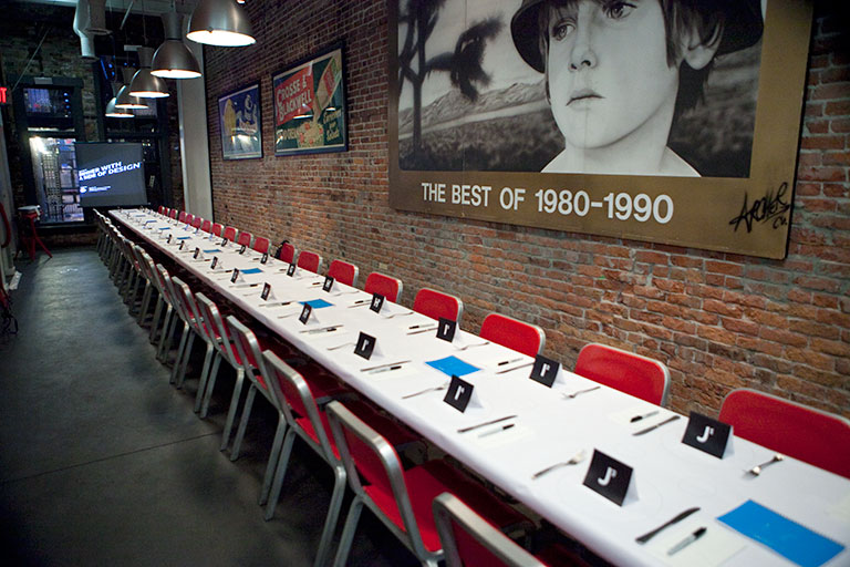
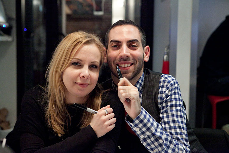
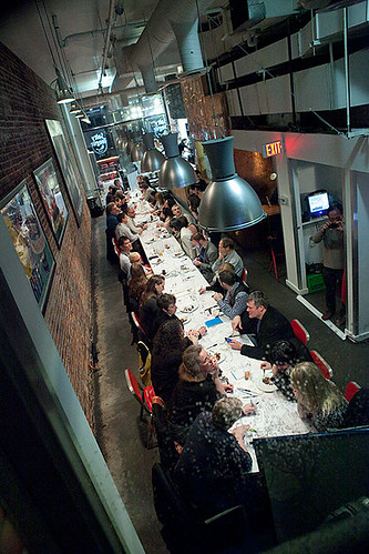
Photos by Danny Chan
24 April 2010
I can hardly believe it but this event is finally here! The collaborative process was awesome and the iterations diverse! Here is the front cover for the guide I crafted to prepare participants for the experience. There will be more goodies presented at each dinner. Ready or not, here we go!
18 April 2010
I had the privilege of sharing my research at frogdesign in Seattle this week and one member of their team sent me this delightful set of graphs about my talk. In light of this (discussed briefly during my chat), I thought this visualization was quite relevant. The "dots on some cards" can be viewed here. To see the content more clearly, click on each image.


15 April 2010

08 April 2010

I found this in the archives (from a Design21 competition I entered a long time ago). In light of the concept, who would have imagined I'd end up planning this event?

30 March 2010
 A long time ago, without knowing what design was, she dreamed of creating something that would make a difference in the world (although she did not use these words to describe it as such, at this stage in her life).
Her father wouldn't accept the terms, "I'm bored" (and this boundary kept her imagination alive). Rainy afternoons were not measured in front of the television. Found objects, dried leaves and paint offered the tools to create her own personal narrative.
This is me. With an awesome hairdo, exquisite fashion sense and a means to visualize my ideas. And for the record, I'm ever so curious to recall what I actually crafted on this particular day.
(This photo is courtesy of my dad)
22 March 2010

A Sort of Revolution: Episode One
Are you ready for a change? What does that mean?
To the cooks in a school cafeteria in West Virginia, change means,"It has to come from the top." Jamie Oliver demonstrates that real change may cost you everything you've got.
If you've worked on projects where the objective is design for social change, this episode speaks on a whole bunch of levels. As a designer, it hosts a glimpse into the process of navigating complexity and seeking to employ human centered design methods when addressing a problem. If you ever wanted to see this methodology in action, this episode offers insight (more than you might imagine). You can watch in the USA or Canada.
Here's what I take away from Jamie's initial foray into the community of Huntington:
1) Three to four months of investment with the community will reveal more than two weeks ever will.
2) Visualizing the problem and an accessible solution is essential to understanding.
3) The system is complex and you have to navigate it. No shortcuts.
4) People skills are part of human-centered design. And even with them, your best intentions may be misunderstood.
5) The outsider who wants to change the way things are will always pose a threat.
Anything else?
18 March 2010

I asked the students I work with (as a seminar leader for an Ecological Design course) to come up with a problem or issue that they'd want to see discussed when designers and city leaders connect at Dinner With A Side Of Design. Here are some of their thoughts based on course content:
1) How can you make policy knowledge more accessible to people?
2) How would you make sustainable design more convenient?
3) How would you shift food safe policies so people could bring their own dishes for take out?
4) How would you improve the space and riding experience on the bus?
5) How would you improve the bus scheduling so people would choose to take the bus over a car?
Do you have any to add?
Image source: All Free Crafts
12 March 2010

 Okay, so I'm not really there. I'm in rainy Vancouver with a hashtag and an online web schedule. Clearly, the event is jam packed with all sorts of goodies. As I looked through the long list of presenters, I came up with ten sessions (in no particular order) that I'd want to be listening in on:
1) Long Distance UX (Alex Cook and Lisa Kamm)
Collaboration is key to the UX process, but it becomes increasingly difficult across locations. Working remotely with engineers, product managers and other UX'ers is challenging. Learn how members of the Google UX team work with other offices and team members domestically and internationally to create the best user experiences possible.
2) Design for Awareness: Mobile Technologies & Health (Robert Fabricant)
This presentation will explore an emerging class of design solutions that combine mobile technologies and sensors to target a variety of health issues. These technologies have the potential to heighten our awareness of our own behavior in meaningful ways, opening up new opportunities and challenges for interaction designers.
3) Blah Blah Blah: Why Words Won't Work (Dan Roam)
Since the industrial revolution, we've judged human intelligence by our ability to talk. And just look at where that belief has gotten us: from politics to energy, we're deeper in conceptual debt than ever. This session shows how combining our innate verbal and visual skills is the only way we're going to solve the big problems ahead.
4) The Final (Mobile) Frontier: Battery Life in Africa (Gabrielle Rosario and Mike Stopforth)
Africa is a much misunderstood market, but potentially as large as China or India. Computer and internet penetration is extremely low, but cellphones are everywhere. How to tackle communication and social services on a continent where electricity - including charging cellphones in rural areas - is the greatest challenge.
5) Getting Your Company Funded (Reid Hoffman and Justin Fishner-Wolfso)
In this presentation, learn all the basics on how to take your company to the next level. Get the skinny on how to accept angel or VC funding without giving away the farm. There's so much jargon around financing and this session will debunk it all -- including term sheets, liquidation preferences, board composition, demand rights, option pools, valuations and much much more.
6) Interactive Infographics (GOOD)
Insights and examples from the frontier of interactive infographics. The smart, interactive presentation of data is emerging as a new form of media. Still in an early stage, this format shows major promise. We'll explore what this is all about and where it's going.
7) Design for the Dark Side (IDEO)
Design usually focuses on making the world around us better - optimism often rules the roost in our industry. But what might happen if we forced ourselves to design for a catastrophic or dystopian future? Can we learn something by designing for a darker side of human experience?
8) DIY U: Edupunks, Edupreneurs and the Coming Transformation of Higher Education (Anya Kamenetz)
9) UX Process Improved: Integrating User Insight (Steve Portigal and Aviva Rosenstein)
Finding detailed specifications for implementing user research methods is easy - but matching specific methods to your particular needs can be a challenge. We'll outline an underlying framework for research approaches so you'll understand why each method works as well as when to use it.
10) Keynote by Valerie Casey
(Now to check out the music and film line up!)
07 March 2010
 Wicked problems. Also known as "the things that seem too big for us to solve." I stumbled across this old Adidas ad campaign and have adapted it to craft a contractual agreement with said problems. It isn't comprehensive but offers a helpful icon when I consider how my creative thinking process permits the "willing suspension of disbelief" in order to face something that seems too big or impossible. Thanks to Twitter feeds, I came across this 1992 article by a great writer and design thinker, Richard Buchanan:
To gain some idea of how extensively design affects contemporary life, consider the four broad areas in which design is explored throughout the world by professional designers and by many others who may not regard themselves as designers:
1) the design of symbolic and visual communications
2) the design of material objects
3) the design of activities and organized services, which includes the traditional management concern for logistics, combining physical resources, instrumentalities, and human beings in efficient sequences and schedules to reach specified objectives
4) the design of complex systems or environments for living, working, playing, and learning. This includes the traditional concerns of systems engineering, architecture, and urban planning or the functional analysis of the parts of complex wholes and their subsequent integration in hierarchies.
Reflecting on this list of the areas of design thinking, it is tempting to identify and limit specific design professions within each area - graphic designers with communication, industrial designers and engineers with material objects, designers-cum-managers with activities and services, and architects and urban planners with systems and environments. But this would not be adequate, because these areas are not simply categories of objects that reflect the results of design. Properly understood and used, they are also places of invention shared by all designers, places where one discovers the dimensions of design thinking by a reconsideration of problems and solutions.
Buchanan's work reminds me that "design thinking" isn't a buzzword. And it's exciting to see these programs emerge to create an educational outlet for developing these ideas further (as my educational experience didn't include this type of conversation):
Parsons
Austin Center for Design
05 March 2010
Nobody has the answers.
Nobody is listening to you.
Nobody is looking out for your interests.
Nobody will lower your taxes.
Nobody will fix the education system.
Nobody knows what he is doing in Washington.
Nobody will make us energy independent.
Nobody will cut government waste.
Nobody will clean up the environment.
Nobody will protect us against terrorist threats.
Nobody will tell the truth.
Nobody will avoid conflicts of interest.
Nobody will restore ethical behavior to the White House.
Nobody will get us out of Afghanistan.
Nobody understands farm subsidies.
Nobody will spend your tax dollars wisely.
Nobody feels your pain.
Nobody wants to give peace a chance.
Nobody predicted the Iraq War would be a disaster.
Nobody expected the levees to fail.
Nobody warned that the housing bubble would collapse.
Nobody will reform Wall Street.
Nobody will stand up for what’s right.
Nobody will be your voice.
Nobody will tell you what the others won’t.
Nobody has a handle on this.
Nobody, but you, that is.
Never forget, a small group of people can change the
world.
No one else ever has.
by Micah Sifry
excerpt from What Matters Now
02 March 2010
I'm teaching the last six weeks of a course called, Designing With Image and Time and I've asked the students to work with various films as part of their learning process. One of the options included The Fog of War: Eleven Lessons from the Life of Robert S. McNamara. As I re-watched it, I couldn't help reflecting on the idea that these lessons could be applied anywhere, even in design. Would you agree? Watch the film and get back to me.
1. Empathize with your enemy the client/user you don't understand
2. Rationality will not save us
3. There's something beyond one's self
4. Maximize efficiency
5. Proportionality should be a guideline in war design
6. Get the data
7. Belief and seeing are often both wrong
8. Be prepared to re-examine your reasoning
9. In order to do good, you may have to engage in evil something you didn't expect
10. Never say never
11. You can't change human nature
01 March 2010

25 February 2010

If Danish designers can do it, why can't we? I appreciate this document for the way it:
1) advocates a collective voice
2) provides objectives and recommendations
3) postures what design can do, rather than what design is
4) determines that design is for people and the planet
5) encourages cross-disciplinary support
And then some.
While manifestos often have a way of making a declaration without encouraging action, I read this document and feel like it gives me language to dialogue about the role of design at this time in history (and makes it accessible by collecting it into one document). Also notable? When I got the email inviting me to read this , it included this phrase at the end (from Pernille Grønbech, President of Danish Designers): We appreciate any comments. Feedback on how these ideas actually translate? What a concept.
24 February 2010

I have the physical cards already but an iPhone app (for travel and the like) is just what this designer needed. What I appreciate about both versions? The special note to respect your participants:
- Approach people with courtesy
- Identify yourself, your intent, and what you are looking for
- Offer to compensate participants
- Describe how you will use this information and why it's valuable
- Get permission to use the information and any photos or videos you take
- Keep all the information you gather confidential
- Let people know they can decline to answer questions or stop participating at any time
- Maintain a nonjudgmental, relaxed and enjoyable atmosphere